


A design system is a comprehensive set of guidelines and design elements that are used to create a consistent user experience across a product or organization. It is essentially a roadmap that outlines the various design decisions that should be made in order to achieve a cohesive, intuitive, and visually appealing product.
Here are some elements of the design system -
Design Principles

Design principles are a set of guiding values that shape the look and feel of a product. They are essentially the core beliefs and goals that drive the design process, and they help designers create a cohesive, visually appealing, and intuitive user experience.
Many different design principles can be used, and the specific principles that are chosen will depend on the goals and target audience of a particular product. Some common design principles include:
Simplicity: Simplicity is the principle of keeping things as simple as possible, without unnecessary complexity or clutter. In design, simplicity is often achieved through the use of clean lines, clear typography, and minimalistic color palettes. By simplifying a product, designers can make it easier to use and understand, which can improve the overall user experience.
Functionality: Functionality is the principle of designing products that are effective and efficient at achieving their intended purpose. In design, functionality is often achieved through the use of a clear layout, intuitive navigation, and well-placed calls to action. By focusing on functionality, designers can create products that are easy to use and accomplish the tasks that users need them to do.
Accessibility: Accessibility is the principle of designing products that are usable by as many people as possible, regardless of their abilities or disabilities. In design, accessibility is often achieved through the use of clear, readable text, high-contrast color schemes, and responsive design principles. By making products accessible, designers can ensure that they are usable by a wider audience, including people with disabilities such as visual impairments or mobility issues.
Usability: Usability is the principle of designing products that are easy to use and understand. In design, usability is often achieved through the use of clear layout, intuitive navigation, and simple, concise language. By focusing on usability, designers can create products that are accessible and easy for users to accomplish their tasks.
Aesthetics: Aesthetics is the principle of designing products that are visually appealing and aesthetically pleasing. In design, aesthetics is often achieved through the use of color, typography, and composition. By focusing on aesthetics, designers can create products that are visually appealing and create a positive emotional response in users.
Overall, design principles are an important aspect of the design process, as they help guide designers in creating products that are cohesive, functional, and visually appealing. By establishing clear design principles, designers can create products that are intuitive, easy to use, and effective at achieving their intended purpose.
Style Guide
A style guide is a document that outlines the specific design elements that should be used in a product, such as typography, color palettes, and imagery. The style guide serves as a reference point for designers and developers, helping them to ensure that their work is consistent with the overall design direction of the product.
It is an important tool for maintaining consistency in design, as it helps ensure that all of the different elements of a product fit together seamlessly and create a cohesive look and feel. By establishing a set of clear guidelines for design elements, a style guide can help designers create products that are visually appealing, easy to use, and effective at achieving their intended purpose.
A typical style guide will include the following elements:
Typography: The style guide will outline the specific typefaces that should be used, as well as the sizes and styles of headings, body copy, and other text elements.
Color palette: The style guide will define the specific colors that should be used in the product, as well as how they should be used and combined. This might include a primary color palette as well as secondary and tertiary color options.
Imagery: The style guide will define the types of images that should be used in the product, as well as guidelines for cropping, resizing, and placing images.
Layout: The style guide will outline the general layout principles that should be followed when designing different pages and screens in the product. This might include guidelines for grid systems, white space, and hierarchy.
Components: The style guide may include a library of pre-designed UI elements that can be easily reused in different contexts, such as buttons, forms, and tables.
Overall, a style guide is a valuable tool for ensuring consistency in design and helping designers create products that are visually appealing, easy to use, and effective at achieving their intended purpose. It serves as a reference point for designers and developers, helping them to ensure that their work is aligned with the overall design direction of the product.
UI Patterns
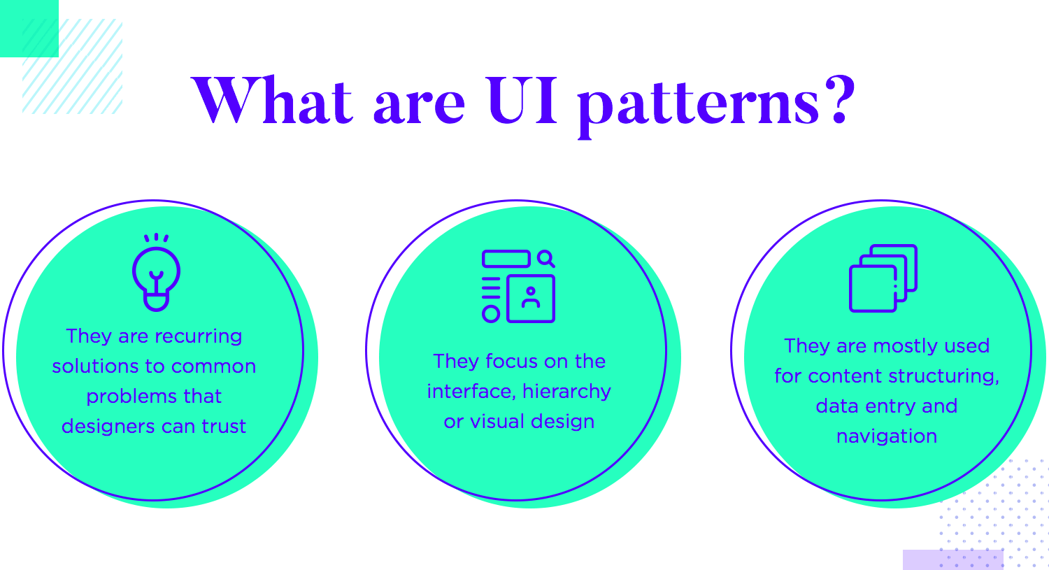
UI patterns are design solutions that have proven effective in solving common user interface problems. These patterns provide a tried-and-true approach that can be followed by designers to create intuitive and effective user interfaces. Some common examples of UI patterns include:
Navigation menu: This is a common pattern used to help users find their way around a website or app. A navigation menu is typically located at the top or side of the page and lists the main sections or pages within the site. For example, a navigation menu on a retail website might include links to the home page, categories of products, and customer service.
Search bar: A search bar is a UI element that allows users to search for specific content within a website or app. This pattern is often used in conjunction with a navigation menu to help users find what they are looking for more quickly.
Carousel: A carousel is a UI pattern that displays a series of items, such as images or product listings, in a rotating fashion. This pattern is often used to showcase featured content or to allow users to browse through a large number of items without taking up too much space on the page.
Pagination: Pagination is a UI pattern that allows users to navigate through a large number of items, such as search results or product listings, by breaking them up into smaller, more manageable chunks. This pattern is often used in conjunction with a navigation menu or search bar to help users find what they are looking for more quickly.
Modal window: A modal window is a UI pattern that displays a dialog box or other content in a separate window that overlays the main content of the page. This pattern is often used to display additional information or to prompt the user for input, such as when completing a form or making a purchase.
Here are some well-known design systems in the world.
Material Design
Material Design is a design system developed by Google that provides a set of guidelines, components, and tools for creating consistent, intuitive, and visually stunning user experiences across all platforms and devices. It covers a wide range of design elements, including color, typography, iconography, and layout, as well as motion and interaction design. Material Design is based on the idea of "material," a metaphor for the physical world that allows designers to create digital interfaces that feel natural and intuitive.
Carbon Design System
Carbon Design System is a system of design standards, components, and tools developed by IBM for creating digital experiences. It includes a set of reusable design patterns, customizable UI components, and a design language that can be used across a wide range of products and platforms. The Carbon Design System is designed to help teams create consistent, high-quality user experiences that are aligned with IBM's brand and design principles.
Lightening Design Sytem
Lightning Design System is a collection of design patterns, components, and guidelines developed by Salesforce for creating unified user experiences across the Salesforce ecosystem. It includes a wide range of UI elements, such as buttons, forms, and navigation components, as well as guidelines for typography, color, and layout. The Lightning Design System is designed to help teams create consistent, visually stunning user experiences that are aligned with the Salesforce brand.
Ant Design
Ant Design is a comprehensive design system for enterprise-level products developed by Alibaba Group. It features a set of high-quality React components that can be customized to meet the specific needs of an enterprise product. Ant Design also includes a design language and set of guidelines for creating cohesive and visually stunning user experiences.
Atlassian Design
Atlassian Design System is a design language and set of guidelines developed by Atlassian for creating cohesive and visually stunning experiences across the Atlassian ecosystem. It includes a wide range of design elements, such as typography, color, and layout, as well as a set of reusable UI components and patterns. The Atlassian Design System is designed to help teams create consistent, high-quality user experiences that are aligned with the Atlassian brand.
Overall, a design system is a valuable tool for companies that want to create a consistent, high-quality user experience across their products and materials. It helps ensure that all of the different pieces of a product fit together seamlessly, creating a cohesive and intuitive experience for users. By establishing clear design guidelines and using a set of standardized design elements, companies can create products that are visually appealing, functional, and easy to use.